sofasoda, as an online learning platform was launched to empower young professionals in the digital era to build skills that will prepare them for the future. Due to the changes in business strategies, we shifted to a subscription-based model. Besides soft skills content, we also curated more hard skills content to our library. Contents were created in Taiwan and Hong Kong, and we realized that our content categories were user-unfriendly. They were not structured and not clear for users to find the content they needed easily. Therefore, we decided to revise the information architecture.

Create a clear content information architecture for sofasoda, help users find what they need faster and easier, and increase the click-through rate.
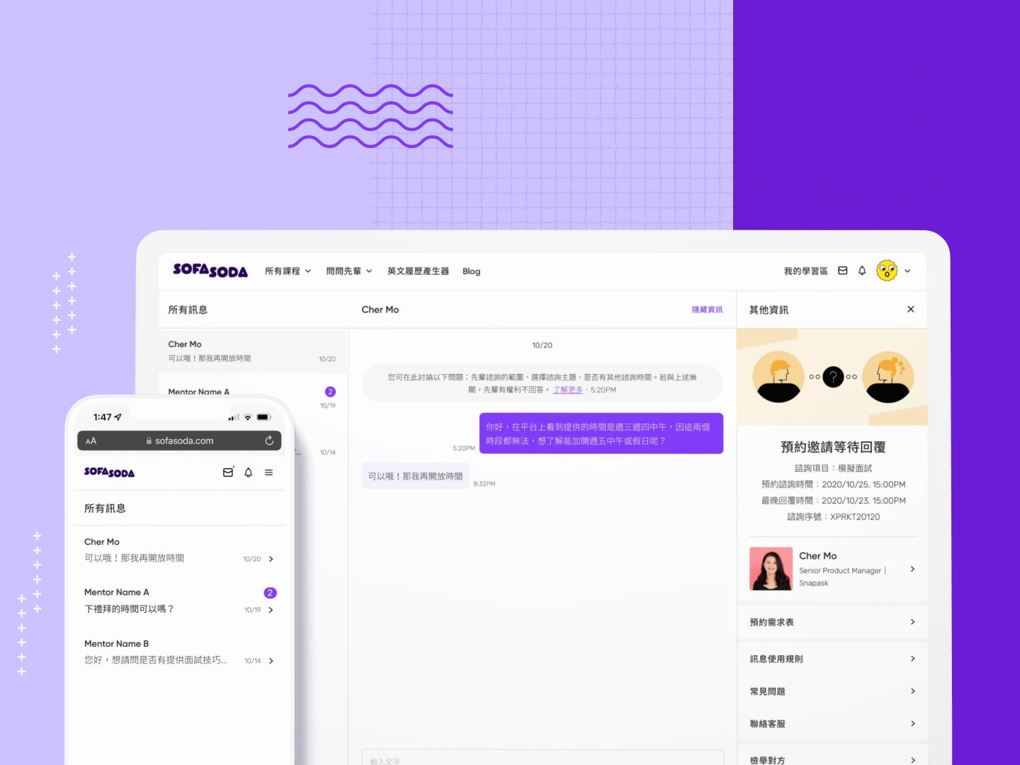
Responsible for clarifying user needs, conducting user testing and design. Supported content managers to define the new content category with the researcher and discussed admin logic with engineers.
There’s a cognition gap between the category defined by the content team and the user’s cognition. How to establish the content structure that fits different regions?
After the revision was released, the click-through rate increased by 24% from all course pages to individual course info pages in three months.


In the early stage of sofasoda, the content was only created within a general category direction, without a structured architecture of content category, adding categories requested solely by marketing needs, which had created confusion for users. The previous design focused on using different sizes of thumbnails to highlight a course due to the number of courses being relatively small. Also, chose to promote manually in the featured section to provide flexibility for the marketing team.
In addition to the unsatisfactory performance of the click-through rate on the course info page, we also found there is a lot of room for improvements, such as copywriting, UI design, and structure from the subscriber interviews.
"There are only two courses in the top section, and I thought those two are all you have."
"The design tried to highlight some courses so the rest below were with smaller thumbnails. It took me a lot of time to understand the structure, and I didn't think it helps."
"The total time helps me decide whether to watch this course. But why some don’t?"
This project is not only content category optimization, but also solves the usability problems of current pages. Therefore, I summarsed the four key points from the subscriber interview and developed ideas and designs according to each of them.
Content hierarchy is confusing, not sure how many topics and types we have
Expect to see what’s new at the first glance
Too many highlight design hinder the ability to quickly find what they want to see
More relevant information, helps them see the value of the course
In the beginning, we only had three categories: technology & business learning content library, general workplace skills, and life & career strategies with roughly defined subjects. The content type was only used in the first category which was confusing. For the very first step, I proposed a version by using existing and the content that may be developed in the future; named three categories to “personal growth”, “career”, and “domain knowledge.” Finally, ask the content managers in both regions to define the subjects with each category. This help users better understand the contents we provide.

.png)

Content type matter or subject matter? According to the interview feedback, we found that for those with working experiences users watch case studies rather than interview content. They think case study has a clear structure and they can adopt and adapt the actions they learn and apply to their current situation. However, the scenario will also affect the decision to watch which type of course.

We found that 0-1 newbies are accustomed to subjects, a common category for online learning platforms. It is also difficult to tell the differences between courses, case studies, and interviews. On the other hand, users with working experiences prefer using type as the first filter because they know what they need. Considering the following factors, we decided to use Version A as the final. (Left: Version A, Type > Subject, Right: Version B, Subject > Type)
At that time, the amount of content is not enough to support subjects as a filter condition. Due to the production limitation, it’s not easy to produce at least one course for each subject in a short period.
To distinguished sofasoda from other learning platform, we want to emphasize the value of content type. sofasoda want to emphasize the value of content type. Also, our main TA are those with working experience; therefore, version A is more suitable for their scenario. While version B has a type tag, it’s easier to ignore when most of the content is course.
Users can see that we have three categories and three content types. They can find by the category they’re interested in and the content they want to watch. Also, there are subject tags on the course card.


In addition to the high maintenance cost of manual drafting, users can’t find the new content because there was no regular update. In the new design, we changed to display automatically when new content goes online with a tag of the new lease and new episode, also changed the copywriting from feature courses to latest leases.
Remove the highlight level and make all course cards the same size and style to avoid misunderstanding. Also, add the speaker title, and subject tag to help users define the value of the content and decide whether to watch this content.

The new content category and all course page design were officially released on 2021/07/15.
From 2021/07/15 to 2021/10/15, the click-through rate from all course pages to the individual course info page increased by 24%. It can be seen that the new all course page has enough information for users to decide whether the content is valuable and take further actions to get to know more.
The new content category is still in use today, and each subject also grows to at least one course. The new structure not only helps the content team to effectively produce content on various subjects but also allows users to better understand the topics we provided.